Question 1: Research and written lesson tasks
This section of the lesson is based around understanding and explaining two colour systems: RBG and CMYK. RBG stands for Red-blue-green and bases the colour picked by the saturation of these three colours. For example, complete saturation of all these colours will yield a white light, but as soon as the green colour is desaturated the light will fade more and more over to purple (being the combination of red and blue.).
CMYK is the other colouring scheme focused on in this lesson and this abbreviation stands for Cyan Magenta Yellow Black. This colouring system works in an opposite way of RBG: blending Cyan, Magenta and Yellow should yield a black lighting, although to substate for impurities in ink the colour black itself is also added. The more a colour is subtracted from the mix, a combination of the two colours remaining will be visible. For example, subtracting the cyan colouring will yield a red mix of yellow and magenta.
The second part of question 1 revolves around developing your own colour schemes using the Adobe Colour tool.
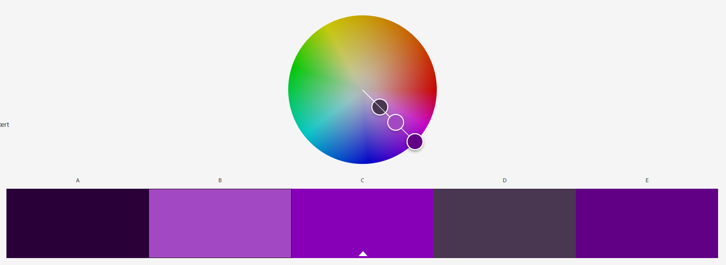
The first colour scheme is a monochromatic system, which means its based on one single colour. This type of system is very useful when you base the design of something off of one colour – it gives you access to different shades and tones within said colour. My colour scheme is based on a purple hue.
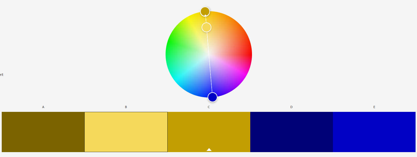
For the second colouring scheme I used a complementary system. This system is rooted in contrast – using two colours to contrast each other on the scale. In this case I picked a yellow and blue colour – two colours which complement each other very well.
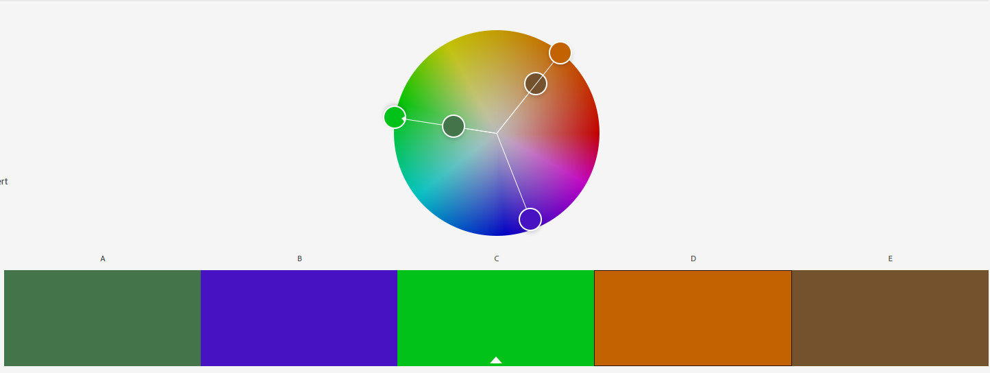
The third scheme is a triadic one, which follow the trend of the two other schemes – but instead of utilizing one and two colours, it is based on three colours. The RBG system is a good example of this. In my own system I have based the scheme on green, purple and orange. Eventhough this is not as simple and easy to use as a scheme consisting of primary colours, I found it and interesting experiment to build upon and utilize secondary colours for my system.
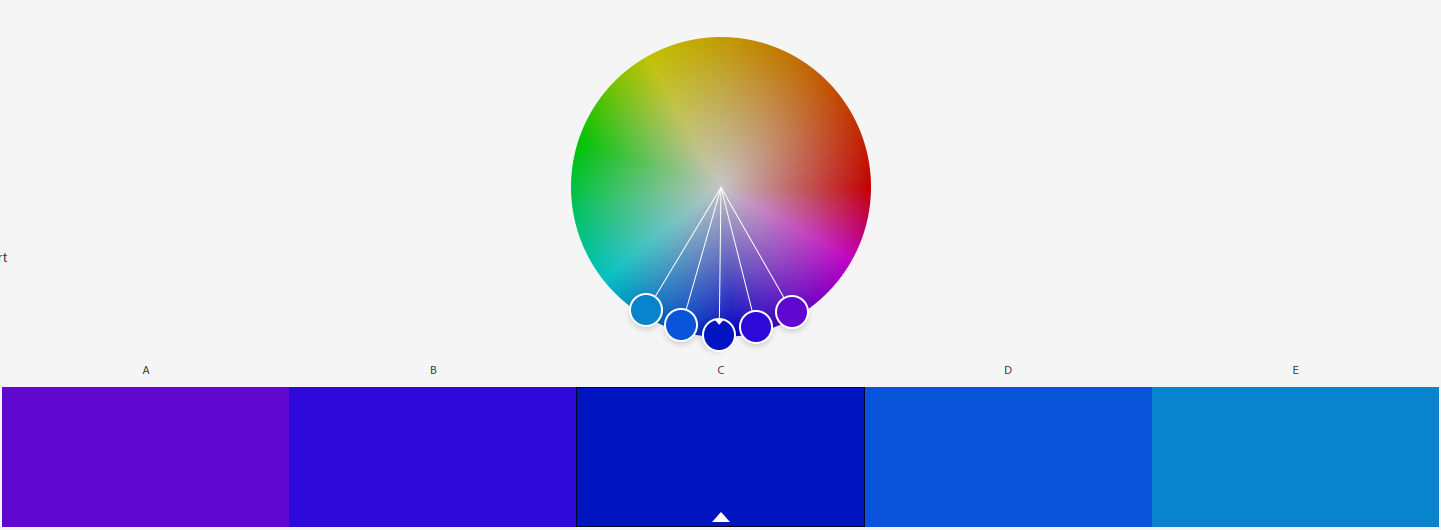
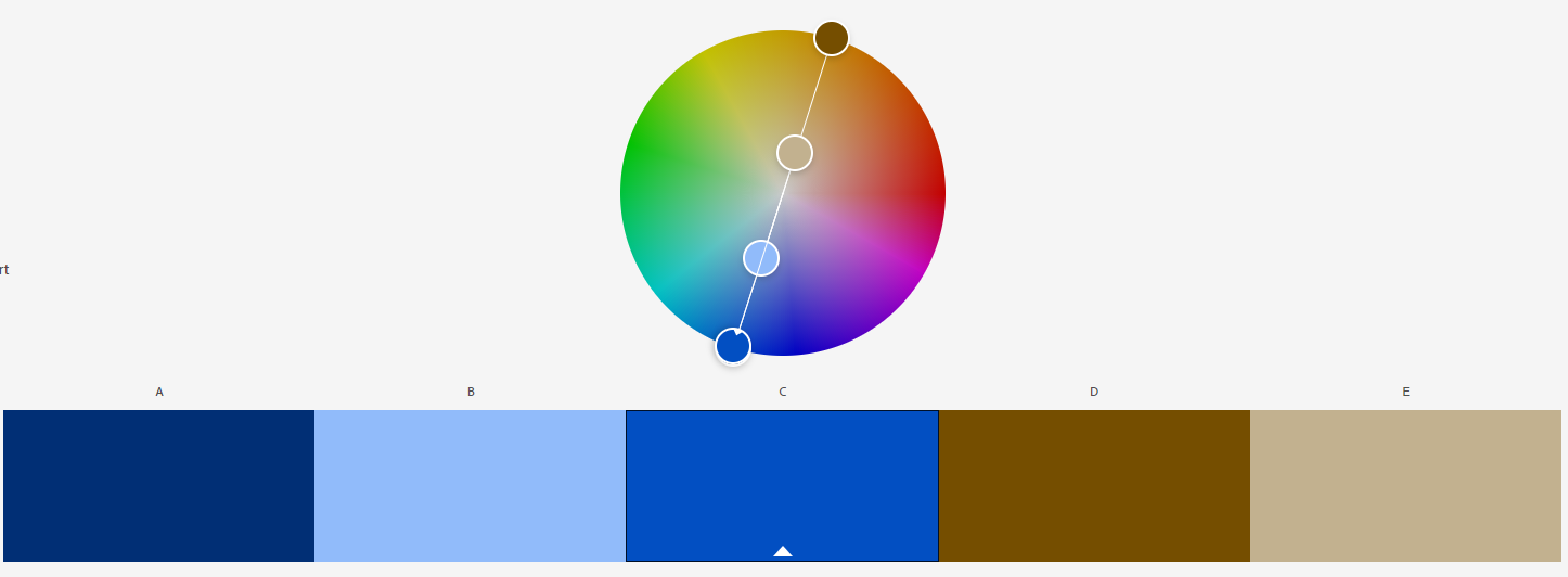
The final scheme is called an analogous system, and varies a little bit from the previous ones. Instead of using contrast, it bases itself on a primary pick and then neighbouring colours to said pick on the colour wheel. That is, it works sort of like the monochromatic scolour scheme in terms of keeping the hue and outcome close to the original colour, but is usefull when you want different shades in your design. In my example I’ve picked blue as my primary colour, which branches out to either purple or a light blue. While the edge cases are vastly different in feel, they both can be very valuable borders when designing within the scope of a blueish hue
Question 2: Practical Lesson Task
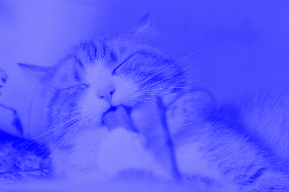
This section is based around using and demonstrating how different gradients and colouring effects change a photo. Using a free-use website for photographs, I settled on using the following picture of a cat as my base picture.

First I created a flourescent duotone using the Gradient Mapping feature in Photoshop. I picked red and blue to contrast each other, and while the image itself doesn’t have strong contrasts I felt like the red lines was highlighted well amongst the otherwise light blue hues.

After having applied a red contrast to the blue, I wanted to use a deeper blue for the monochromatic colour scheme to see how the picture would turn out by using only one colour. I was rather pleased with the result, as even within the same colour the picture still looks dynamic and retains its depth.
Moving over to experiment with the Gradient Tool in photoshop (previous called Split Toning) I applied a layer over the cat to showcase the gradient with a 50% opacity. I picked a light green on one end and a deep red on the other end. The end result makes it look like the cat is present at a christmas party with green and red lightning, which is a pretty fun outcome for a colouring experiment!

The final part of this practice was a freestyle bit. This excited me a lot as I got to play around and try different styles of colouring on top of the adorable creature. I started by playing around with the gradients – discovering new options within Photoshop. While they were compelling and interesting, nothing yielded something as different from the rest of the pictures as I would’ve liked. So I ended up working off the monochromatic model, but attempting to revert the highlights and making it feel like a negative picture. The outcome was interesting and different from the rest, so I that’s the one I’ve chosen to highlight in this post!

Picture source: https://pixabay.com/photos/cat-pet-licking-animal-tabby-cat-323262/
Question 3: Practical Lesson Task (Continued)
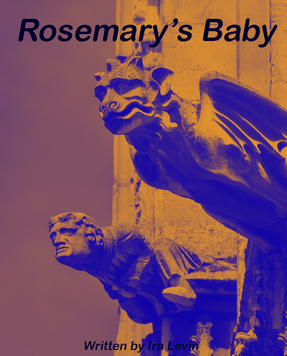
In this final part of the lesson task, I was challenged with an interesting assignment which cumilates everything I’ve learned from this module. I was given a choice between several books to create a cover from and to use colours to create a certain suspense or feeling from viewing the picture. I chose to go with the book «Rosemary’s Baby» written by Ira Levin, where the goal is to use complementary colours to express anguish and uncertainty. Being a fan of the movie adaptation, this choice appealed greatly to me and I went to work. I found a picture I felt fit the mood perfectly – a solemly looking grotesque, which brings forth the despair, sadness and fright portrayed in the book. It sets the tone for the jounrey the protagonist is going to have to go through in the story.

Having found the picture, the difficult part of the assignment began – picking the correct colours and contrast to give the desired mood. I experimented using red (symbolizing the demonic aspects of the book) and blue (symbolizing the sorrow and fright of the main character). Using these colours however would not satisfy the primary challenge in the task – using complementary colours – and ended up looking too drastic and outlandish on the cover. I therefore settled on using slightly easier colours – focusing more on the blue to relate to the dismay felt by the main character and toned down the red to an orange. This gave the colour a more mystique and menacing look, rather than a visceral one. This is the colouring scheme I ended up using:
The outcome of this colour scheme didnt satisfy me at first, but tweaking it slightly it grew on me very quickly; I found myself getting more intruiged by it and the sense of wonder and curiousity for actually picking up the book and reading it myself grew as I polished it. Therefore I decided to run with this as the version to feature in the task.
This conludes the lesson tasks. Thank you for reading through it all and if you are a fellow student please feel free to add any feedback! I hope you’ve learned something from these tasks, I certainly have! c:
Picture source: https://pixabay.com/photos/gargoyle-sculpture-gothic-stone-2516606/
